Chubb
Redesigning a 142 year-old insurance company’s web experience for a modern audience

As one of the leading insurance companies for high net worth individuals and businesses, Chubb was in need of a refresh of their web experience to better match the caliber of their clientele. With the Critical Mass team, I led the effort to reimagine the Chubb brand, streamline the customer experience, and bring the website into a more premium look & feel.
MY ROLE
Lead Designer — Content Mapping, UX/UI Design, Design System Development, Stress Testing/QA
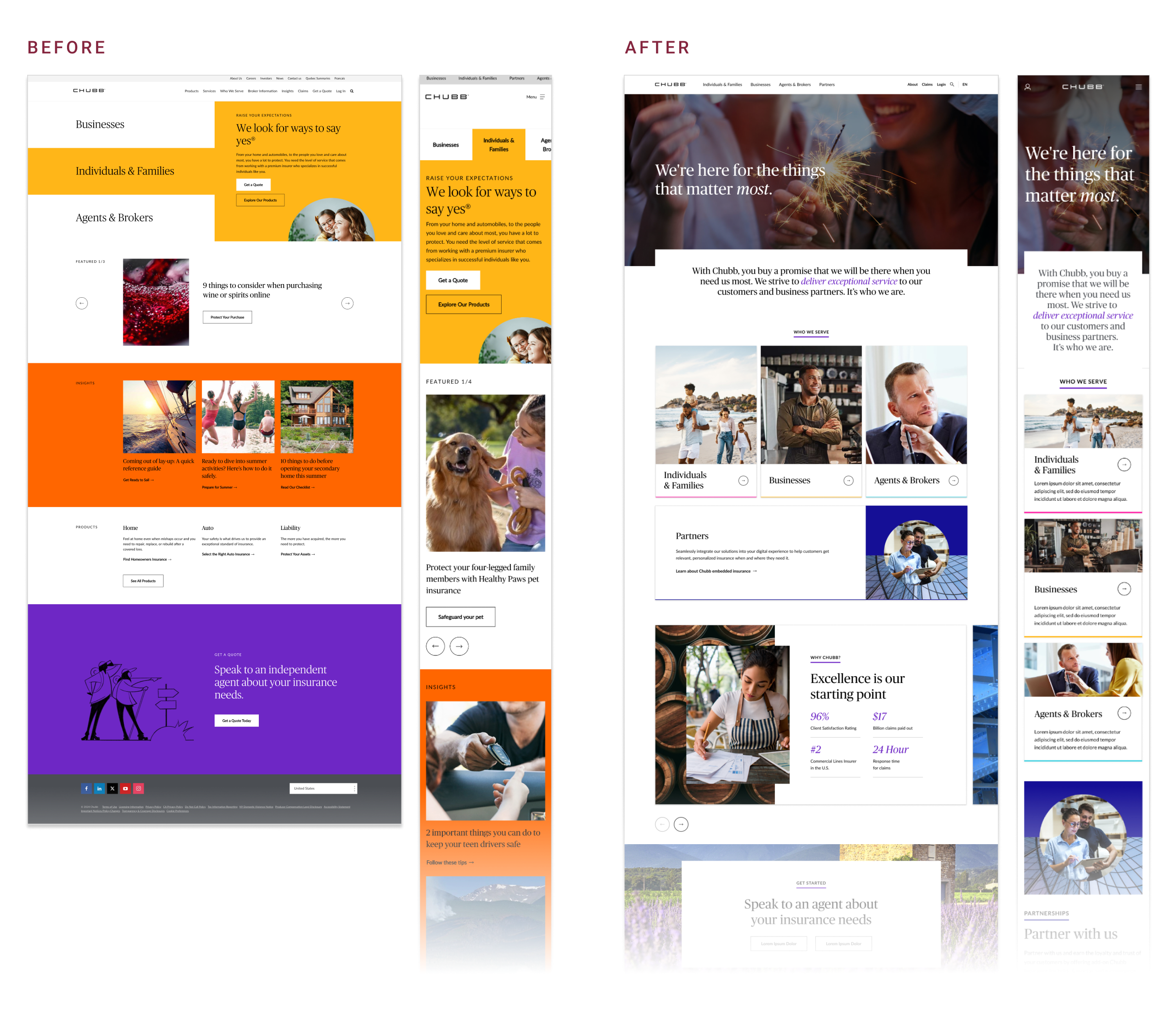
Before & After
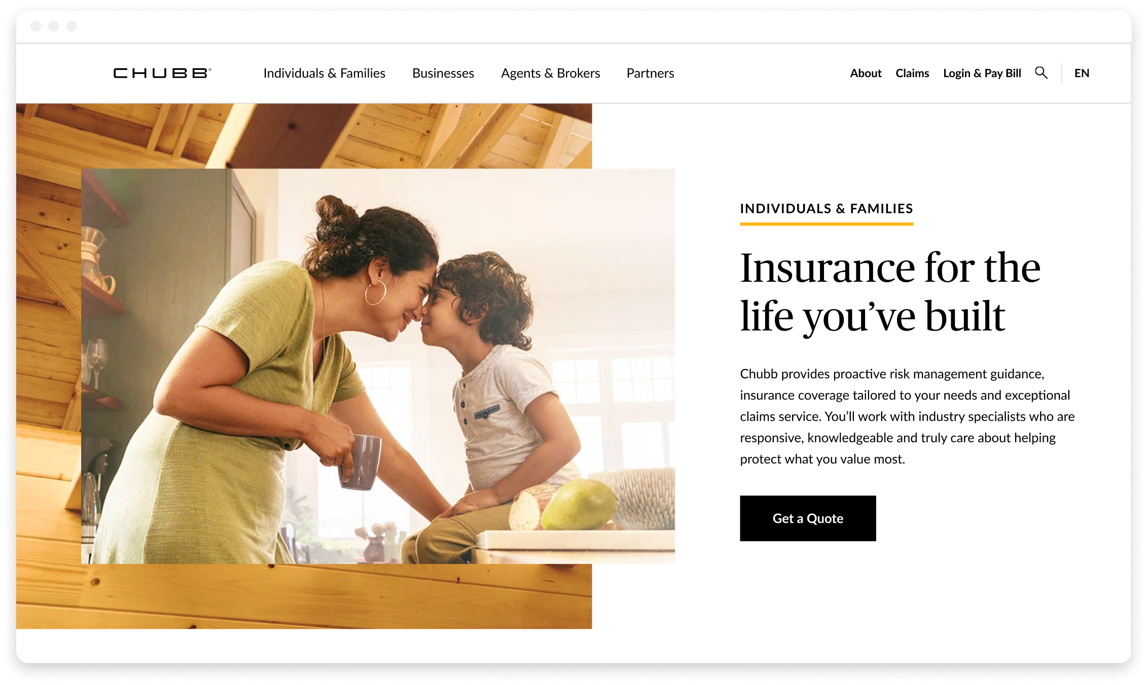
The Chubb experience was due for an upgrade to better reflect their premium offerings and reputation. As the Lead Designer, I managed the efforts to reinvigorate the website by delivering a memorable brand impression, creating meaningful connections through visuals and tone, and providing clear guidance for any user to find what they’re looking for.
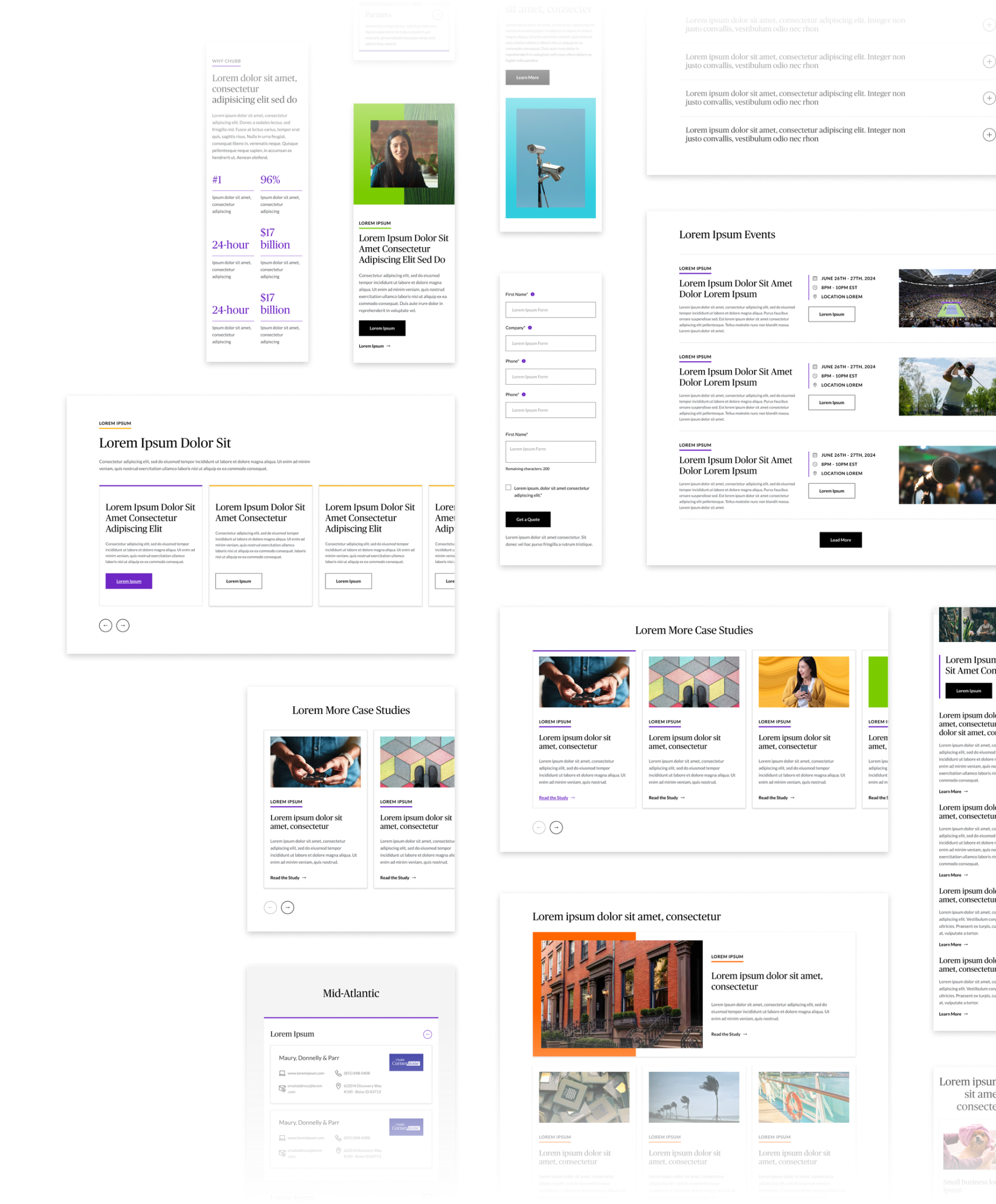
Digital Design System
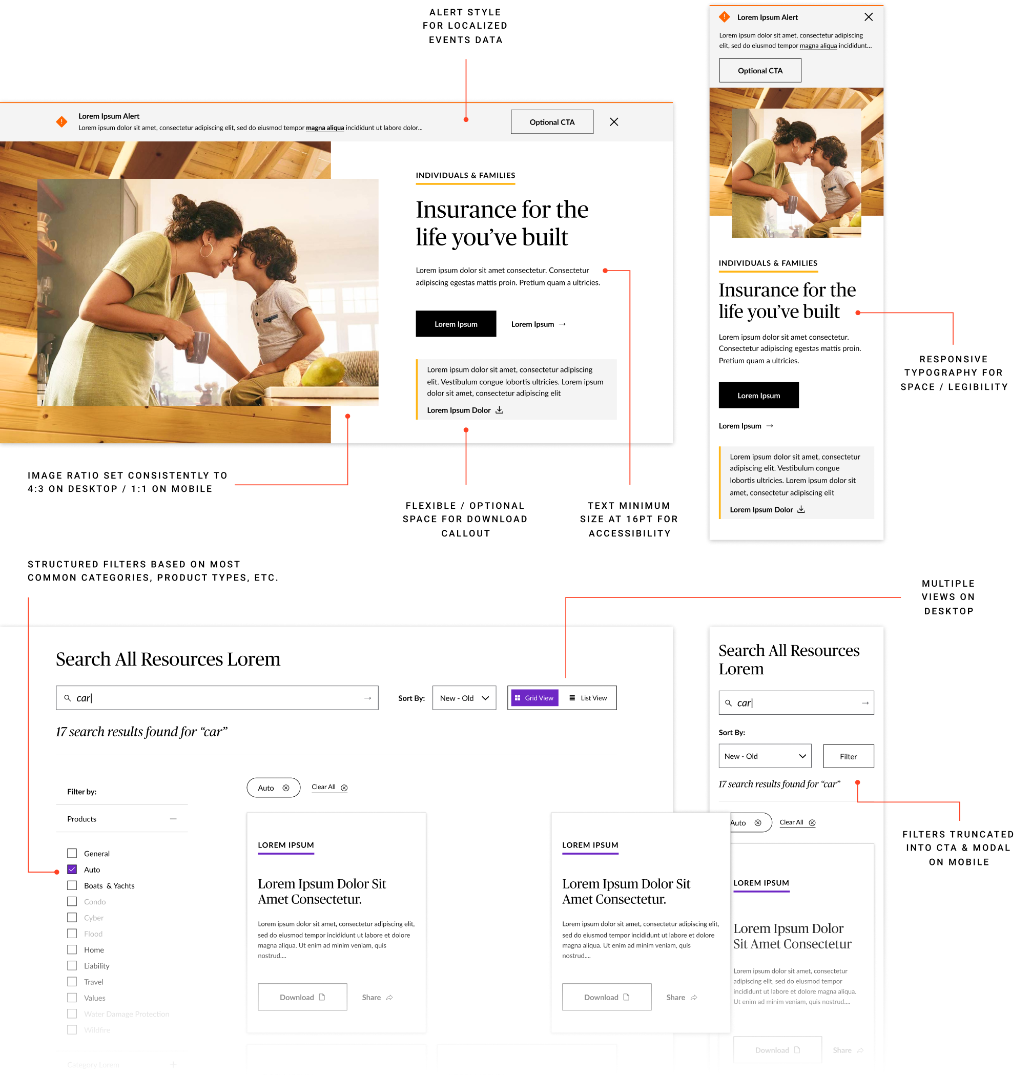
Creating the design system for Chubb was a highly collaborative effort where I worked closely with their dev and content authoring teams to strike the balance between pushing new and dynamic interaction patterns that address business needs and highlighting the technical feasibility for the large repository of existing content.
For each component, I had to consider accessibility requirements, potential for motion, and localization functionality for certain markets. For delivery, I provided in-depth documentation for each and every component so that the engineering team could produce to spec but still allowing room for discussion if enhancements needed to be made with these consideration in mind.
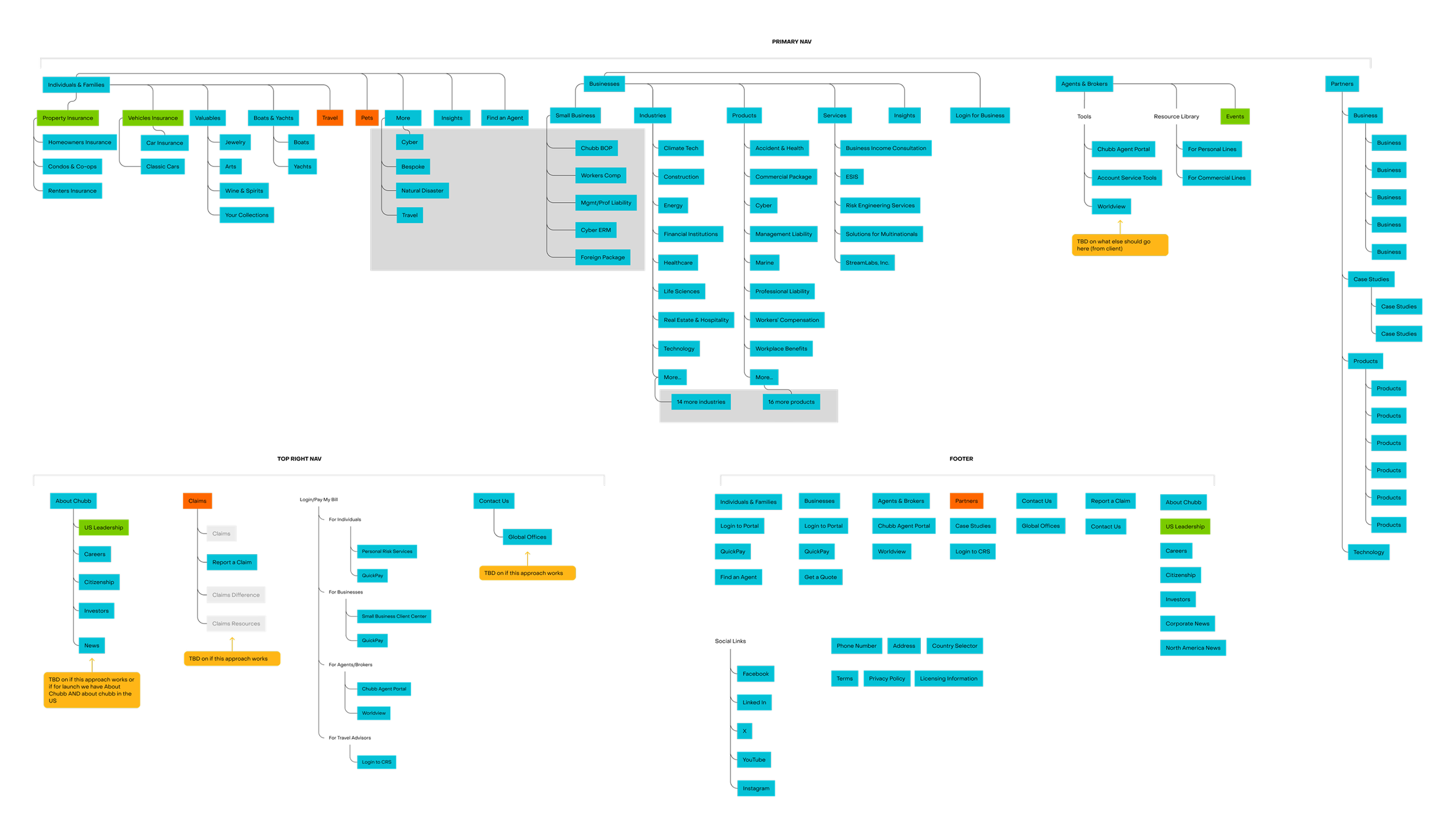
Working closely with the UX Lead, I took stock of the existing navigation and audited the areas where some pages in the IA were duplicative or not often visited, surfaced quick links for users looking for specific entry points, and established a clear visual hierarchy for ease of exploration.
Ensuring this new navigation experience is concise and straightforward was imperative to the overall success of the website and this was a key part of the experience that we put forward into user testing once we solidified the visual direction.
A New & Improved Navigation
Brand Expression & Component Iteration
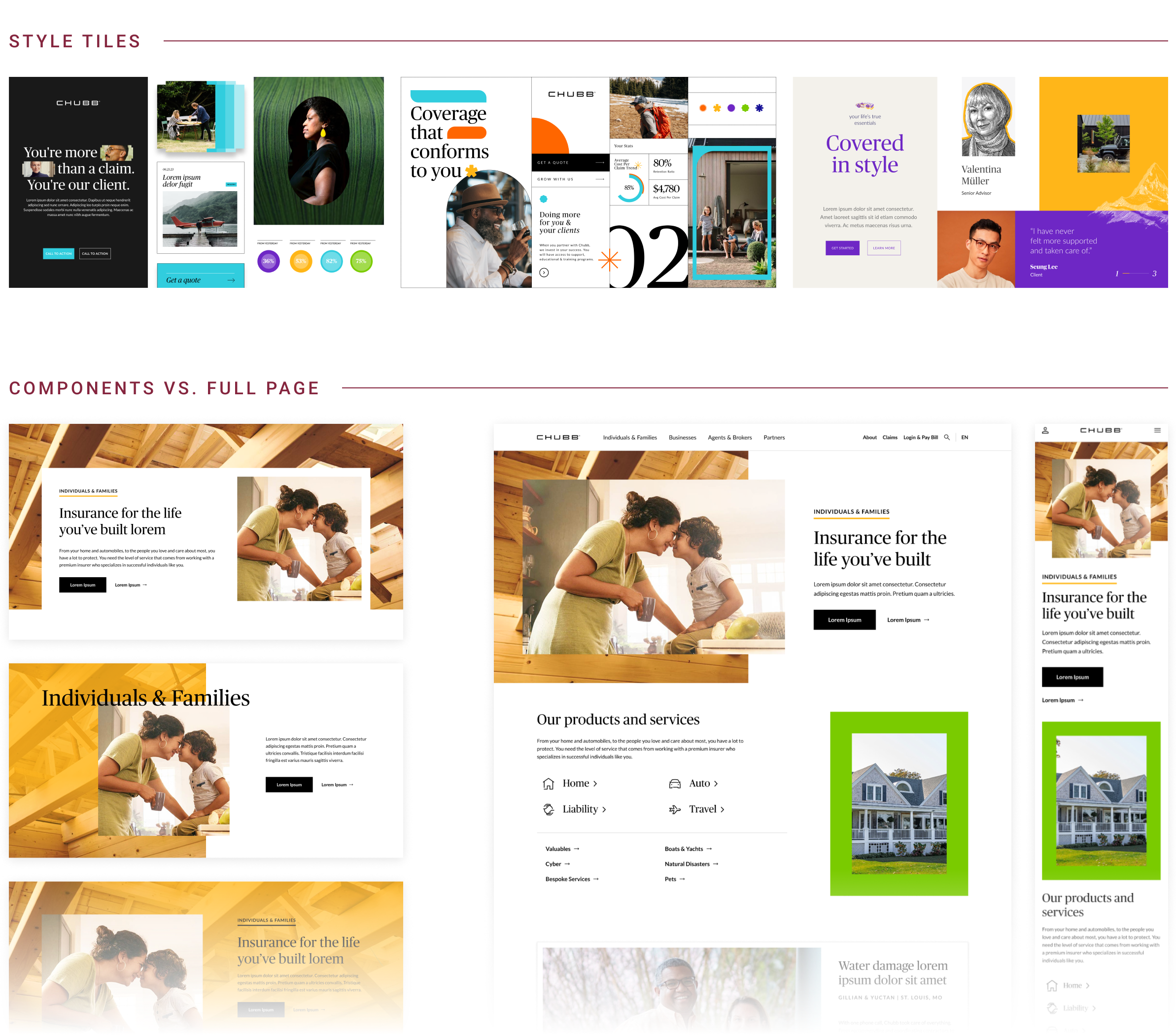
To better gauge the clients’ appetite for a more premium brand expression, I utilized style tiles to help them envision the look-and-feel from a high level while showing how it would be applied to actual interface elements. Once a visual direction was established, I iterated on a large array of component types, collaborating with the design team to finesse and stress test them with content requirements and imagery constraints in mind.
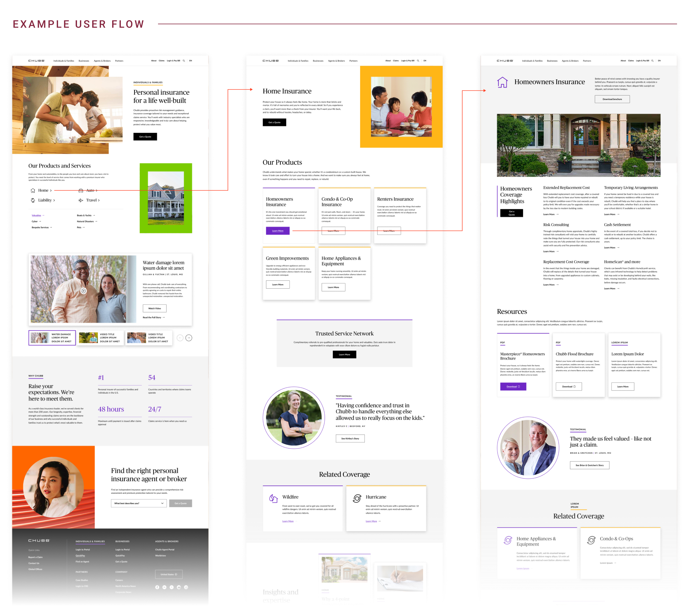
An Easy Path Forward
The new and elevated visuals combined with more intuitive content blocking makes it easier for the user to navigate through the site to find the information they’re looking for. This accommodates users who are clear on their end goal and click through immediately to the intended page, or ones who continue to peruse the various testimonials, relevant stats, and related resources to get a better idea of Chubb’s offerings before clicking through to get a quote.
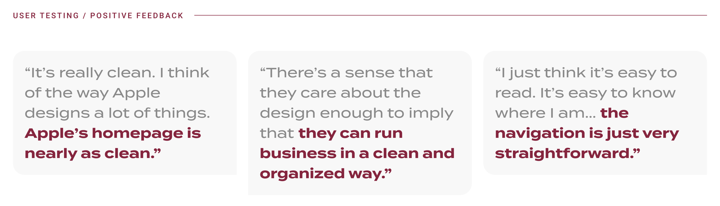
In order to gauge the improvements made to the web experience (with the navigation in particular) the team led a round of user testing, gathering data on whether users could more easily get to the information they needed and if there continued to be any mis-steps during the process.
Not only did this validate that our redesign was clearer and more concise, but that the visual approach conveyed a more high-end and trustworthy brand as a whole.
It proved to be a successful relaunch for Chubb’s major markets with plans to expand the redesign in the near future to other parts of the experience.
Testing
& Launch Results
NAVIGATION TESTING
70% Success
Percent of participants who selected a correct answer, regardless of whether or not they had to jump around a few times before doing so.
51% Direct / 19% Indirect
Percent of participants who went directly to the correct answer vs. percent of participants that landed on the correct destination, but took an alternative path.
DELIVERED / NOW LIVE
Fully launched in two major markets (USA & Ireland)
With plans to launch in further markets throughout 2025, including EU and APAC.
Sold in efforts to further re-work additional parts of the web experience
Testing resulted in recommendations to address the “Get a Quote” feature and improve usability of existing resource libraries and client portals.